
The following images are concepts of theoretical CSS3 features, created in response to CSS3.info's post asking how CSS3 drop shadows might work. Future concepts may be added here later.
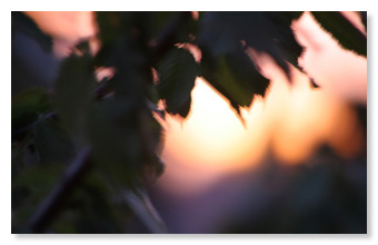
The above image represents a pretty basic scenario; an image with a drop shadow. In Photoshop's Drop Shadow filter settings this image had the following settings (the canvas colour in this example was white):

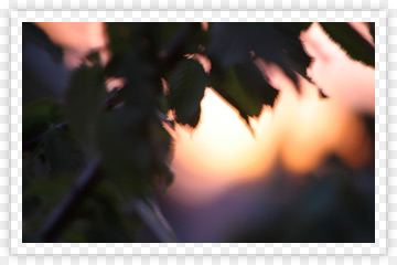
This image represents something slightly different, in essence an element with a border, for which the shadow origin is the element's total dimensions (including the border). This might be how a border-shadow might work, assuming an opaque centre.

This demonstrates how having a separate drop shadow for both element and border might affect the outcome. By having the origin point inside the border, with a radius larger than the border thickness, the shadow extends beyond the border on the sides, but at the corners the square edges of the border intersect the shadow and so 'fade out' the shadow. For contrast purposes I've made the border colour white in this example.
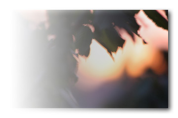
This example demonstrates what happens when an image has variable opacity as well as a drop shadow, with a drop shadow that fades out of view as the source element's opacity diminishes (the effect would be the same for border-images with variable opacity).
In this example, the image has a 10px border which is fully transparent, whilst the border itself has a drop shadow. To properly illustrate the transparency, I've set this against a checkerboard canvas. Since the dropshadow still has knockout, the parts of the shadow intersected by the parent border aren't visible. This example should be contrasted with number 06, which is identical with the exception of the knock-out attribute.
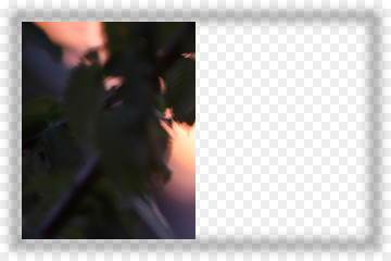
When contrasted with the example above, this demonstrates how the layer knock-out effect works. Here, a fully transparent border of width 10px is no longer knocking-out the border shadow underneath it, and consequently the drop shadow is fully visible. I have made part of the inner image transparent to make the border shadow more clear.